The 5 Worst Places to Hang Artwork in Your Home
Helpful design guidance to elevate your space—without taking away your creative freedom.
Artwork has the power to completely transform a home. It brings personality, emotion, story, and soul into a space. It’s often the piece that makes a room feel finished—the visual pause that invites people to slow down and take it all in.
And yet, artwork placement is one of the most misunderstood parts of home styling.
Many people feel unsure about:
Where art should go
How high to hang it
How large it should be
Whether it should match the furniture
Or if it even “belongs” in certain areas
As a result, artwork often ends up in places that unintentionally make a room feel awkward, unfinished, or visually disconnected—even when the artwork itself is beautiful.
This post is not about rules for the sake of rules. It’s about helpful design guidance—the kind that allows you to make intentional choices with confidence.
And it’s important for me to say this clearly upfront:
At the end of the day, you have full creative control over your home.
These are suggestions, not mandates. Design is personal, expressive, and intuitive.
My goal is to help you understand why certain placements don’t work well—so that when you choose to break the “rules,” you’re doing it intentionally, not accidentally.
Let’s walk through the 5 worst places to hang artwork in your home, why they don’t work from a design standpoint, and what you can do instead to elevate your space.
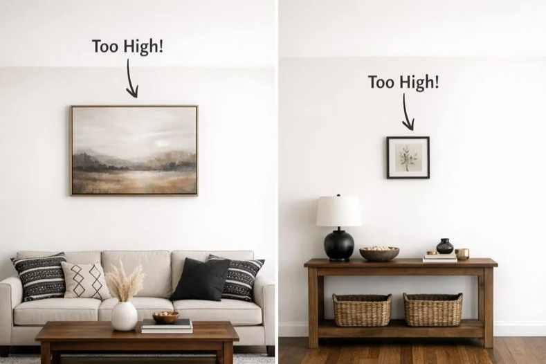
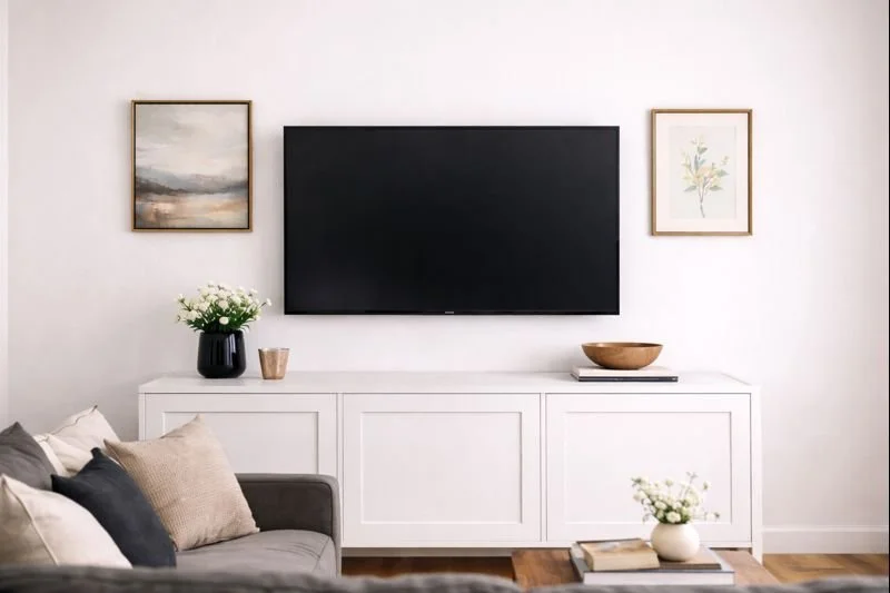
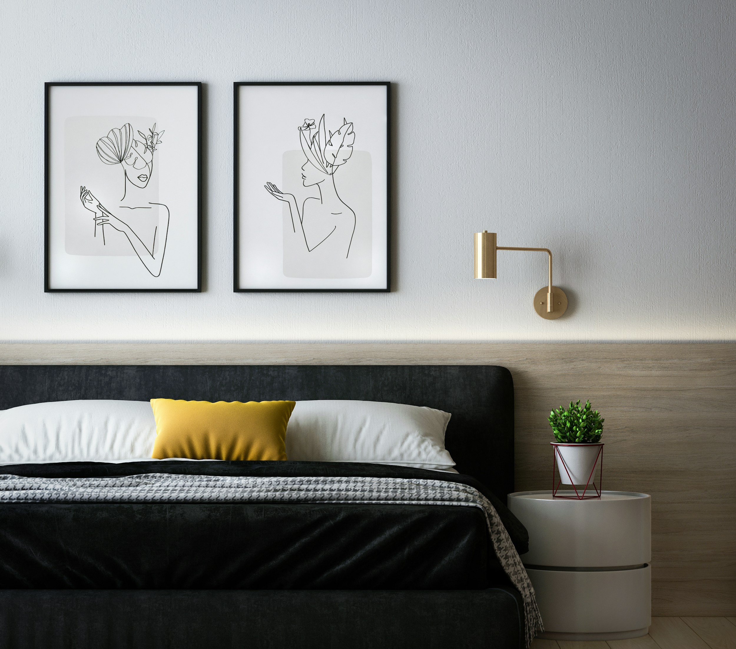
1. Too High on the Wall (Especially Above Furniture)
This is, hands down, the most common artwork placement mistake I see.
Artwork hung too high on the wall creates a visual disconnect. It makes the art feel like it’s floating—separate from the rest of the room—rather than integrated into the space.
Why This Placement Doesn’t Work
It pulls the eye upward, away from furniture and focal points
It creates an awkward gap between the art and what’s below it
It makes ceilings feel taller in an unbalanced way
It can make furniture feel smaller or disconnected
This often happens above:
Sofas
Consoles
Beds
Sideboards
Fireplaces
People tend to hang artwork at standing eye level without considering the furniture underneath. The result is art that feels “lost.”
What to Do Instead
A good general guideline is:
The center of the artwork should be about 57–60 inches from the floor, or
The bottom of the artwork should sit 6–8 inches above furniture
When art is visually anchored to furniture, the entire room feels more cohesive and intentional.
Important Note
If you love your art higher on the wall because it feels airy or dramatic to you—that’s okay. Just know that the reason it may feel “off” to others is because of proportion, not taste.
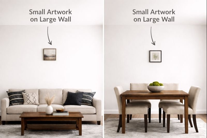
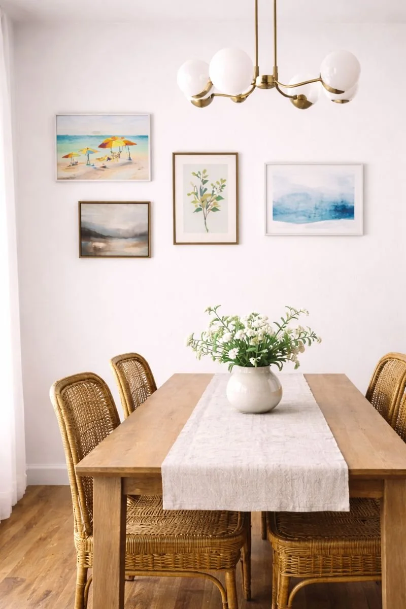
2. Floating Alone on a Large, Empty Wall
A single small piece of artwork on a large wall often looks unfinished—not because the art isn’t beautiful, but because it doesn’t have enough visual weight for the space.
Why This Placement Falls Flat
The wall overwhelms the art
The art feels insignificant or accidental
The space feels under-styled
It draws attention to the wall’s emptiness rather than the art itself
This often happens in:
Living rooms with long walls
Dining rooms
Hallways
Staircase walls
Open-concept spaces
A small piece on a large wall can unintentionally make the room feel incomplete.
What to Do Instead
You have several great options:
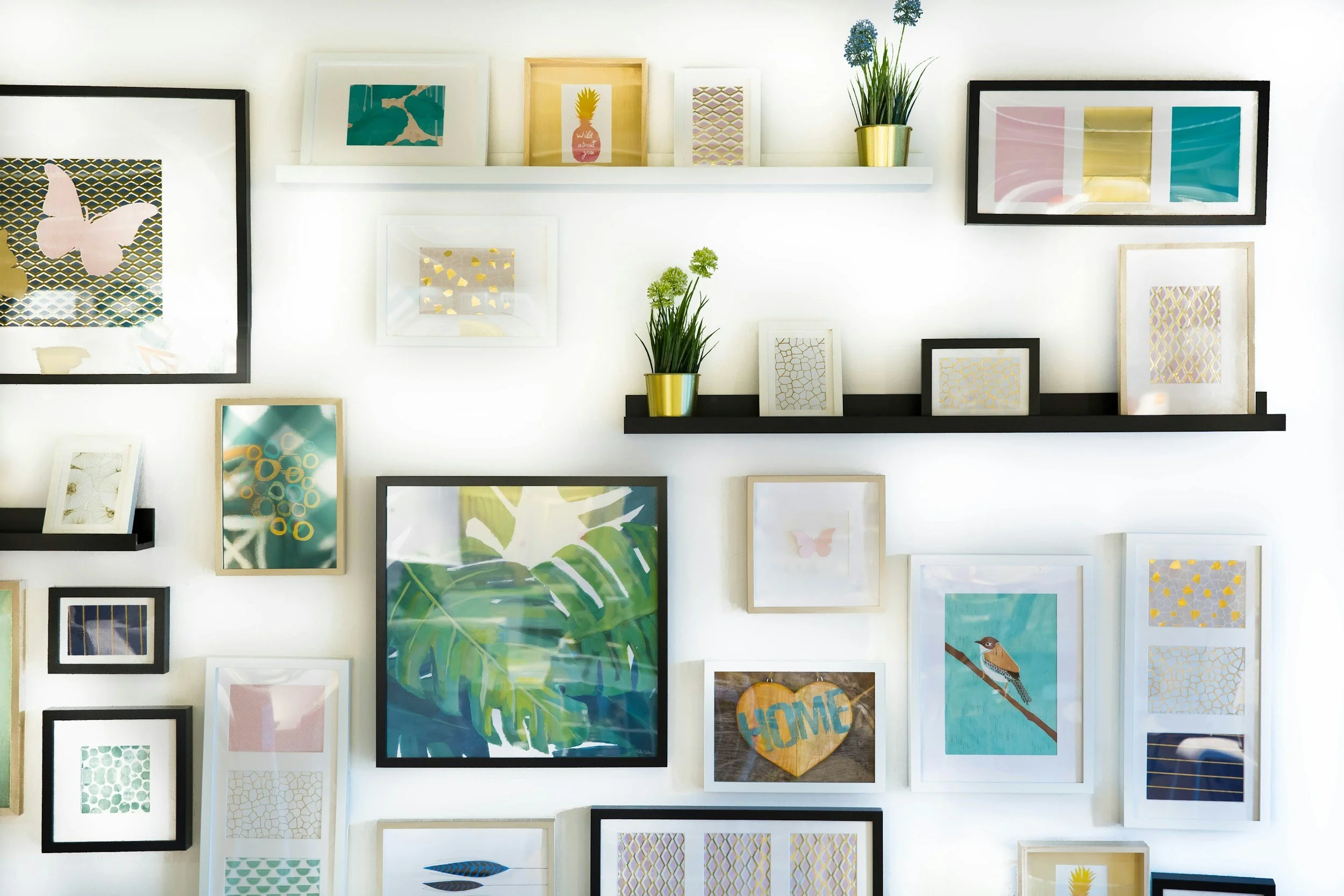
Create a gallery wall using multiple pieces
Choose one larger-scale artwork
Pair artwork with wall sconces, shelves, or a console table
Layer art by leaning larger pieces on furniture
Artwork needs scale or support to feel intentional.
3. In High-Traffic Areas Where It Can’t Be Seen or Enjoyed
Artwork is meant to be experienced—not rushed past.
When art is placed in tight, high-traffic zones, it rarely gets the attention it deserves.
Why This Placement Doesn’t Serve the Art
People don’t stop long enough to notice it
It’s often partially blocked by doors or movement
The scale is usually too small for the space
It can feel like filler rather than a focal point
Common examples include:
Behind doors when they’re open
Narrow walkways
Busy transition zones
Areas cluttered with switches, vents, or controls
What to Do Instead
Reserve artwork for places where people naturally pause:
Above seating areas
In dining spaces
Along staircases where movement slows
In bedrooms
In entryways where guests first arrive
If you do want art in transitional spaces, choose pieces that are:
Textural
Sculptural
Repetitive (like a series)
This allows the art to be felt even in motion.
4. Directly Competing With Another Strong Focal Point
Every room needs a hierarchy—something that leads, and something that supports.
When artwork is placed directly next to or on top of another dominant focal point, the room can feel visually chaotic.
Why This Placement Causes Tension
The eye doesn’t know where to land
Both elements lose impact
The room feels busy or overwhelming
The artwork doesn’t get the attention it deserves
This often happens when artwork is placed:
Next to a dramatic fireplace
Too close to a bold TV wall
Near large windows with strong natural light
Beside oversized mirrors or statement lighting
What to Do Instead
Decide what the primary focal point is:
If it’s the fireplace, let artwork support it—not compete
If it’s a window, consider placing art on an adjacent wall
If it’s a TV, balance art around it rather than directly beside it
Art works best when it complements the room’s focal points, not fights them.
Design Tip
Not every wall needs art. Sometimes restraint is the most powerful design choice.
5. Randomly Scattered Without a Visual Relationship
This mistake isn’t about where art is placed—but how multiple pieces relate to one another.
Random placement often makes a home feel disjointed, even when each individual piece is beautiful.
Why This Happens
Art is collected over time without a plan
Pieces vary greatly in size, style, or framing
There’s no consistent spacing or alignment
Art is hung based on available wall space rather than intention
Why It Feels Off
The home lacks visual flow
Art feels chaotic rather than curated
The eye jumps instead of gliding
The space feels cluttered, not layered
What to Do Instead
Create relationships between pieces:
Align frames along a common top or center line
Keep spacing consistent
Group similar styles or themes together
Use frame color or material to unify the collection
Think of artwork like a conversation—it flows best when the pieces relate to one another.
A Gentle Reminder About Creative Control
I want to pause here and say something important:
There is no “art police.” There is no single correct way to decorate your home.
And you are never doing it “wrong” simply because you like something.
Design guidelines exist to help you understand why something feels off—or why it feels right.
Once you understand that, you are free to:
Follow the guidelines
Bend them
Or break them completely (I do!)
The most beautiful homes are not the most “perfect”—they are the most intentional.
How to Know If Your Artwork Placement Is Working
Ask yourself these questions:
Does the artwork feel connected to the room?
Does it enhance the space rather than distract from it?
Does it feel balanced in scale and placement?
Does it reflect you?
If the answer is yes, you’re doing something right.
Final Thoughts
Artwork is deeply personal. It tells your story. It reflects your taste, your memories, and your creativity.
The goal is to help you place your art in a way that:
Honors the artwork
Enhances your home
Creates visual harmony
And helps your space feel more intentional and elevated
When artwork is placed thoughtfully, it doesn’t just decorate a room—it completes it.
Need Clarity on Artwork Placement or Design Direction?
If you’re feeling unsure about where your artwork should go—or how to bring your entire space together in a way that feels cohesive and aligned—I’d love to help.
✨ Book a design clarity session with me to get personalized guidance, creative solutions, and clear direction tailored specifically to your home.
Together, we can:
Identify what’s working and what’s not
Find better placement solutions using what you already own
Create a design direction that feels natural, confident, and intentional
You don’t have to guess or second-guess your choices. Sometimes all you need is clarity.
Shop My Finds